03 PMPL
Case file 03 · PMPL
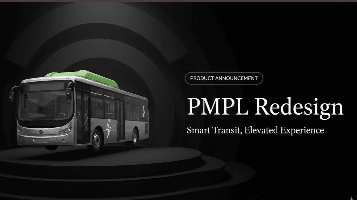
Redesigning the PMPL website
A redesign of the PMPL website for a cleaner look and simpler, more intuitive navigation: modernizing the visual identity while keeping the brand recognizable.
- Year
- 2024
- Role
- Solo: UX and UI design
- Duration
- 2 months
- Platform
- Responsive website
Problem
The existing site had dated design patterns, a confusing navigation structure and a weak mobile experience.
What I did
Redesigned it solo over two months: a cleaner visual identity, simpler navigation, and a responsive layout.
Where it is
Placeholder: was the redesign shipped, pitched, or a self-initiated concept?
What was wrong
Where the old site got in the way
Navigation
A complex structure that confused people looking for something specific.
Visual design
Outdated patterns that made the brand look less credible than it is.
Mobile
A poor experience on phones. Placeholder: what you found, and how.
How I approached it
From audit to redesign
Placeholder: how you studied the old site, what you changed first, and the trade-offs between a fresh look and keeping the brand recognizable.
The redesign
What it looks like
screen soon
screen soon
screen soon
What I learned
What I learned
Placeholder: what this redesign taught you.
 Cleo